

Midjourney
The New York Yankees and Los Angeles Dodgers wear hats that can be found in nearly every country around the world. There are a few other franchises that have well-known looks, but we wanted to see what would happen if we asked AI to create new hats for all 30 MLB teams. Which of these looks would you want to see on the diamond in the future?
1. Oakland Athletics

Midjourney
The A’s may not be in Oakland for much longer, so the club may be looking into uniform changes soon. If the A’s move to Las Vegas but opt to keep green and gold as their color scheme — this hat isn’t too bad. The AI forgot to add the “‘s” to the logo, but otherwise it works. The ‘A’ is bold, and the gold design on the bill is unique. Solid start to this exercise.
2. Colorado Rockies

Midjourney
This might be one of our favorite hats that AI created. The Colorado Rockies have had the same interlocked ‘CR’ hat since entering the league, so a new concept would be welcomed. This hat maintains Colorado’s familiar purple, but also represents the state well by incorporating trees. The silver emblem in the middle would be hard to decipher without context, but knowing that it belongs to the Rockies makes it clear that it is a mountain top.
3. Washington Nationals

Midjourney
This time around, the AI didn’t stray too far from reality. The Nationals regularly wear a red hat with a cursive ‘W’ on the front. This look features a slightly different ‘W’, and pink has replaced the classic red. We like the pink hat as it fits in with Washington’s Cherry Blossom inspired City Connect uniform.
4. Pittsburgh Pirates

Midjourney
This hat fits the name. The Pirates have one of the best looks in baseball, and this hat doesn’t try to do too much. The leather lid and yellow stitching gives the hat a rougher look — one that we think is fitting for the Pirate name. This hat looks like it’s been at sea for a while.
5. Arizona Diamondbacks

Midjourney
Let’s say this first — Arizona needs to go back to the purple and teal combo. While the current colors aren’t bad, the purple/teal is 100 times better. This hat created by AI is wild. The pattern looks like it was somewhat(?) inspired by a snake, while the ‘D’ no longer has a snake head. Not the best, not as bad as some hats to come…
6. Minnesota Twins

Midjourney
Minnesota has a classic hat, but AI delivered some fire with this one. The color scheme stays true to the Twins, and we really like the logo. Instead of the usual ‘TC’ logo, it looks like AI decided to go with a double ‘T’. TWINS. It works.
7. Kansas City Royals

Midjourney
Royalty. That is the first thing that comes to mind when looking at this hat. So, that is why we think this AI creation is a winner. There is no debating which team this hat belongs to — the Kansas City Royals. It would look even better if the team was competitive, but they have time to turn things around before this imagined hat becomes a reality.
8. San Diego Padres

Midjourney
San Diego ditched the blue it wore for much of the 2000s in favor of the team’s beloved brown/gold combo, and everyone is in favor…except AI. The program decided to bring the blue back to San Diego — and created a crazy hat in the process. The two-tone hat features palm trees and what appears to be waves crashing onto the shore (very San Diego), and the logo has been altered to show an ‘S’, ‘D’, and ‘P’.
9. Texas Rangers

Midjourney
This is one boring hat. The red bill is a nice choice to compliment the white lid, but the logo itself is too small and the white gets lost in the rest of the hat. We thought everything was supposed to be bigger in Texas?
10. Milwaukee Brewers

Midjourney
Milwaukee ditched its hat that looked like this for much of the 2000s, and replaced it with a modernized version of its classic logo. So, fans will probably be upset with the AI for returning to the ‘M’. In reality, it isn’t a bad look. The ‘M’ looks to be enlarged in this shot, but otherwise it’s relatively unchanged. We could picture the Brewers wearing this on the field.
11. Los Angeles Angels

Midjourney
If the Angels trade Shohei Ohtani or watch him leave in free agency this winter, they might as well start over and introduce new uniforms. The club has maintained the same look for more than 20 years, and it is certainly time for a refresh. This hat isn’t too far off from the current look, but we like the all-white logo against the red lid.
12. Cleveland Guardians
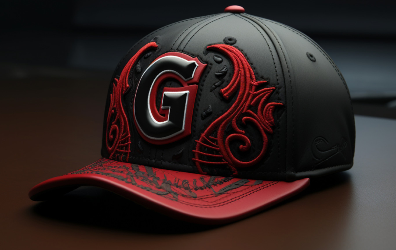
Midjourney
The Guardians are another team in need of a new uniform — but this hat is hideous. There is nothing wrong with Cleveland’s current ‘C’ lid, so AI did too much here. The block ‘G’ is too clunky, the bill looks like someone spilled paint on it, and the red patterns surrounding the logo are questionable at best.
13. Cincinnati Reds

We should have seen this one coming. What else would an AI tool do when reimagining a hat for a team named the Reds? This hat isn’t great, but the white outline saves it from being a giant, bloody mess. Who else is in favor of Cincinnati rocking its City Connect hat more often?
14. Seattle Mariners

Midjourney
The Mariners have some great hats — their regular lid, City Connect, and throwbacks are all awesome. For this one, AI seems to have stolen the light green color from the NHL’s Seattle Kraken. And, guess what? It works. The ‘S’ is bigger than what we’re used to, but there isn’t much to complain about with this one.
15. Baltimore Orioles

Midjourney
The Orioles are thriving in 2023 on the diamond, but could you imagine how scared teams would be if they saw these hats in action? The bird on this hat looks like it is out to kill. The beak is massive, and that thing is looking to poke some eyes out. What a job by the AI.
16. Detroit Tigers

Midjourney
Yeah…no. This one is a complete failure. The tiger looks like it’s confused by the Cincinnati Bengals introducing a white helmet and is now unsure of its own identity. The claw marks on the hat are tacky. This hat would be mocked by everyone in the league.
17. Miami Marlins

Midjourney
Anything is better than what the Marlins are currently wearing on their heads. The franchise never should have abandoned the teal/silver/black uniforms that it won two World Series in. This hat is not on the same level as the old school hat that featured the ‘F’ and marlin, but it’s way better than the current look.
18. Chicago White Sox

Midjourney
Simple, but clean. The White Sox have been an embarrassment on the field in 2023, but they have one of the better looks in the league. Their hat is unique and is easily identifiable. This time around the AI program replaced the black lid with a white one, and turned the typically-white logo black. This is a winning look.
19. Houston Astros

Midjourney
These could easily be worn with Houston’s City Connect uniform — the one which says ‘Space City’ across the chest. This hat looks like it belongs in space. Some may say it looks like the moon, but we think it resembles a person looking back towards Earth through the clouds. We wouldn’t wear it, but it’s pretty solid.
20. New York Mets

Midjourney
Poor, poor Mets. What is this hideous creation? The two-tone bill resembles a NERF Vortex — that football with a tail from your childhood. The color of the lid doesn’t fit with the orange/blue bill. If the entire hat was the darker blue it would be okay. Instead, this is gross.
21. Tampa Bay Rays

Midjourney
We’re in favor of bringing the Devil Rays logo back, but this is interesting. The color of the hat hits the mark — although we can’t tell if the bill is a slightly darker blue than the rest of the hat. Either way, we like it. The logo clearly has a ‘T’…and then a mix of a ‘D’ and ‘B’? AI could have taken the easy route and just put the animal back on the hat.
22. San Francisco Giants

Midjourney
At first glance, this hat is fine. The pattern on the bill is out there, but it’s not the worst look imaginable. Where we have problems, however, are with the orange mass on the side of the hat and within the logo itself. The mass on the side of the hat looks like something out of Stranger Things. As for the logo, it contains an extra line in the ‘F’.
23. Philadelphia Phillies

Midjourney
The Phillies shouldn’t mess with their hat — at least if it looks anything like this. It would be one thing if the cream color was featured on the front panel instead of the back. Instead, this hat comes off as unfinished and amateurish. The fans would boo this one just like they’ve grown to boo Trea Turner.
24. Toronto Blue Jays

Midjourney
Sonic, is that you? Something about this logo looks very familiar. Overall, we think AI did a decent job with this one. The blue jay is massive and looks intimidating. The shine pops off the rest of the hat, as well. We slightly favor Baltimore’s new hat over this one — but we could come around.
25. Atlanta Braves

Midjourney
Atlanta’s hat is another one that shouldn’t be messed with. However, this still resembles the Braves enough that you would know who the hat belongs to. A white lid replaces the typical blue look, while a stylized ‘A’ is underlined by a tomahawk. It’s unlikely the league would allow the tomahawk’s inclusion on the hat at this point. AI should know better.
26. St. Louis Cardinals

Midjourney
What in the world…
St. Louis’ classic red remains the dominant color on this AI creation, but the rest of the hat is out of control. Not only is there a cityscape, but the logo itself appears to feature a cardinal sitting in a nest. We have no more words for this mess.
27. Chicago Cubs

Midjourney
The AI embraced the ivy, what about you? Wrigley Field is famous for many reasons, one of which is its ivy covered outfield walls. So, it is only appropriate that the AI program designed this hat. Our favorite part of this hat is the logo — one that is seen on the home uniform, but never on the hat itself.
28. Boston Red Sox

Midjourney
There are now two monsters at Fenway Park. Move over Green Monster, this hat is now the scariest thing at Fenway. There is nothing to say about this hat that would do justice to what we feel while looking at it. Disgusting stuff from AI.
29. Los Angeles Dodgers

Midjourney
Do we ever want to see the Dodgers wear this hat? No. Can we imagine the team selling it in the team store and giving it away on a promotional night? Absolutely. Los Angeles’ hat is recognizable across the globe. The cursive font on this hat is fun, as is the floral pattern in the background. While it’s not horrible. it reminds us too much of grandma’s couch.
30. New York Yankees

Midjourney
Seriously? This is the best the AI could do with the New York Yankees? We suppose credit is due for the iconic logo being left alone. However, this is as boring as it gets. Let’s hope the Yankees never actually wear this on the field.


